M-Print Mobile — UX Redesign Case Study
OVERVIEW
Timeline: September 2020 - ? (still in progress!)
Team: Solo project
Tools: Figma, inVision
Skills Utilized: User research, usability tests, wireframes, mockups
WHAT IS M-PRINT?
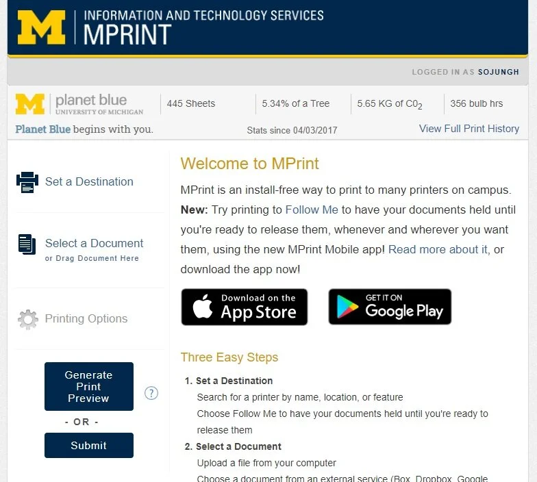
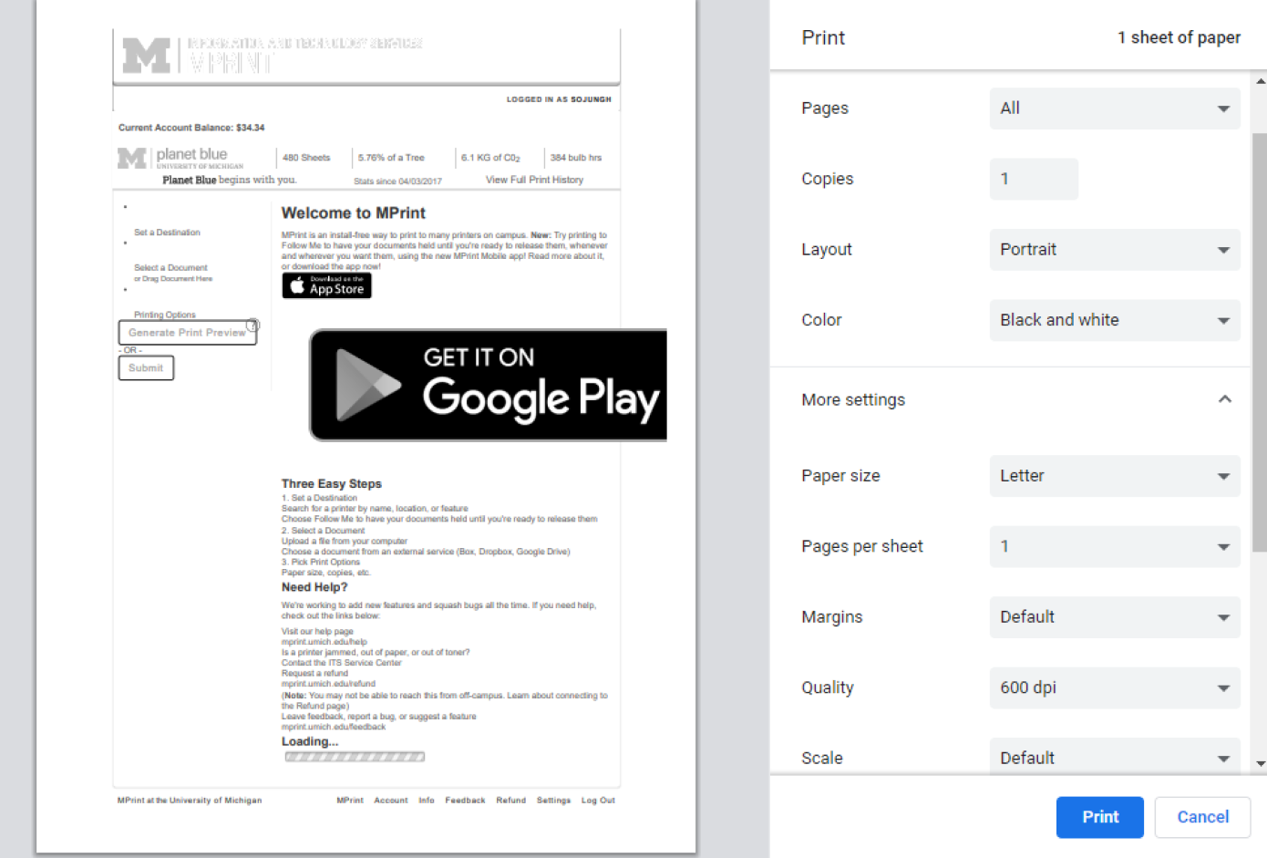
M-Print is the University of Michigan’s install-free printing service.
By visiting mprint.umich.edu on any computer, students can print documents to specific printers on campus anytime and anywhere. You simply set a printer destination, upload your document, adjust its settings, and submit it.
Meanwhile, the M-Print mobile app, our focus for this project is another method for students to print on the go.
The Follow me feature allows the user to control when and where a document is printed through their mobile phone. This is especially important now, with the COVID-19 guidelines where students need to avoid public spaces.
While great in concept, the app currently has a 1.9 star rating on the Google Play store. Let’s find out why.
THE PROBLEM
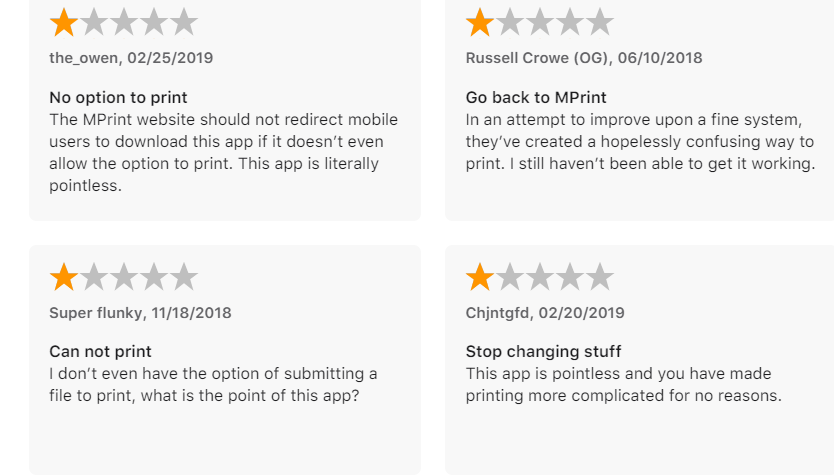
According to these reviews, using the M-Print mobile app is complicated, confusing, and pointless. This means that the current process is not working.
No option to submit files on the app
Misleading and confusing
Unable to actually use the app
Let’s take a closer look at the actual app itself.
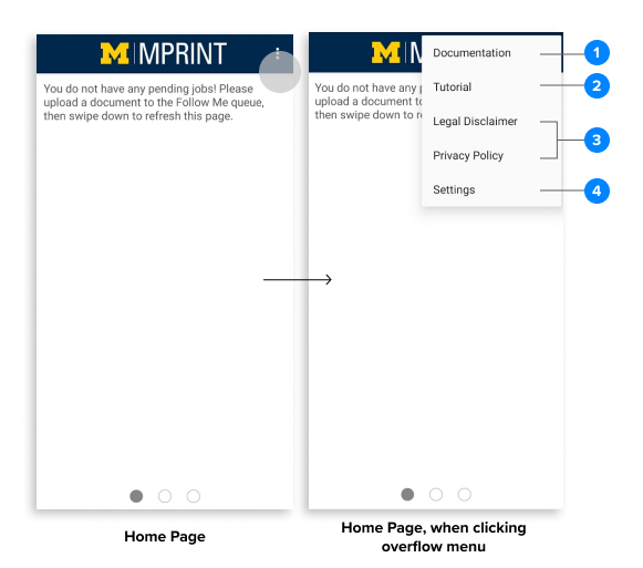
M-Print Mobile Homepage is blank. It provides no clear instructions on how to upload a document to the queue through your phone. It’s functionality is limited to the tabs:
1. Documentation — opens a web browser to the documentation page.
2. Tutorial — opens a landing page showing how to use the app This is what users need to see the first time they open the app
3. Legal Disclaimer + Privacy Policy
4. Settings — options to submit feedback, log out, and change document release methods (QR code v.s. Bluetooth)
RESEARCH
Select reviews of the app taken from the app store and Google Play store.
“I don’t even have the option of submitting a file to print, what is the point of this app?”
“The MPrint website should not redirect mobile users to download this app if it doesn’t even allow the option to print”
“Other than that, it would be great to have an option to never use Bluetooth.
”This is horrible. I couldn't figure out how to use it. “
QUICK USABILITY TESTS
In addition, I also conducted a quick usability test.
5 users were tasked with uploading a document and printing to a printer of their choice.
The result? Many could not get past the first task of uploading a document.
From this usability test, it’s clear that the lack of clear instructions, the inability to submit files, and immobility led to users being confused, unable to use the app for its intended purpose.
GOALS
From these results, it’s clear that M-Print Mobile is in desperate need of an overhaul. I defined a goal for this case study.
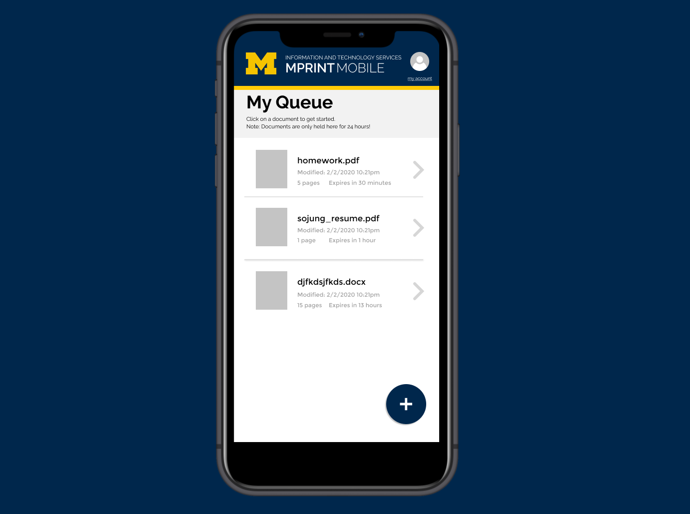
Design a clear, straightforward user interface to allow easy uploading of documents and printing from the user’s mobile phone. Make it clear that the app can stand alone from it’s desktop counterpart.
IDEATION
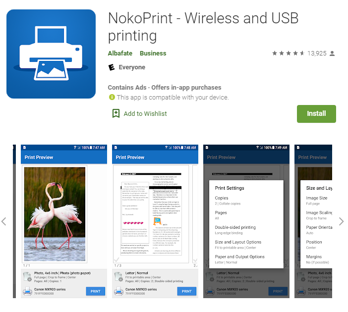
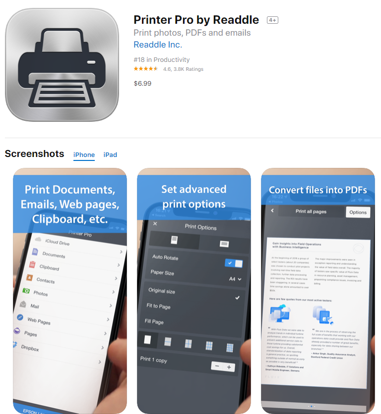
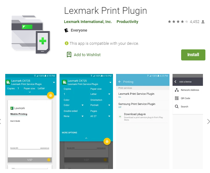
While M-Print has no direct competitors, I analyzed other mobile printing apps, or anything that involved the uploading of files on the app store.
Their home pages feature a variety of methods to upload your file. This includes Google Drive, Email, the phone’s internal files, photo gallery, and etc. Considering the many places a student’s homework assignment can be stored, we should consider applying that to our app as well.
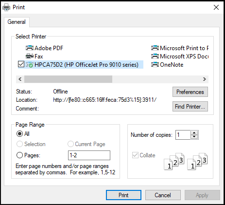
Inspiration was also taken from print dialogues from Google Chrome and Windows.
Here are some sketches of these ideas.

WIREFRAME
I then fleshed out an iteration of the sketches to encompass the whole user journey.
Features I wanted to include in this initial redesign is:
A meaningful boarding process to help the user ease into using MPrint mobile.
Visible, actionable buttons
Integration with common document apps such as Google Drive, Canvas, etc.
Confirmation screens
LO-FI MOCKUP
A lo-fi mockup was created to gain a general sense of how the user interface will look. Basic user testing will take place to gain feedback and further identifying user needs.
PROTOTYPE
Prototype can be viewed here.